Purple Reign: Dress Your Home In Ultra Violet, Pantone’s Colour Of The Year
If you haven’t already heard, Pantone’s 2018 Colour of the Year is a striking blue-based purple: Pantone 18-3838 Ultra Violet, chosen because Pantone wanted to pick something that brings hope and an uplifting message. “From exploring
Historically, there has been a mystical or spiritual quality attached to ultraviolet. The colour is often associated with mindfulness practices (a huge trend itself in 2017), which offer a higher ground to those seeking refuge from today’s over-stimulated world. The use of purple-toned lighting in meditation spaces and for other wellbeing purposes is believed to energise and inspire.
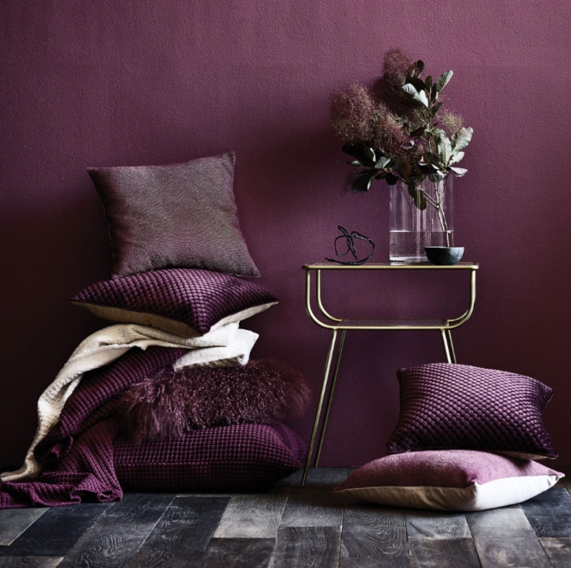
For 19 years, Pantone’s Colour of the Year has influenced product development and purchasing decisions in multiple industries, including fashion, home furnishings and industrial design. With the world looking to the company for palette leadership, the selection process requires thoughtful consideration and trend analysis. Experts at the Pantone Color Institute comb the world looking for new influences, which can include films in production, travelling art collections, fashion, textures, social media platforms – and even upcoming international sporting events.
“The Pantone Colour of the Year has come to mean so much more than ‘what’s trending’ in the world of design,” says Laurie Pressman, vice president of the Pantone Color Institute. “As individuals around the world become more fascinated with colour and realise its ability to convey deep messages and meanings, designers and brands should feel empowered to use colour to inspire and influence.”
The good news for interior design enthusiasts is that ultraviolet was selected from the Pantone Fashion, Home and Interiors Colour System, the most widely used and recognised colour standards system for fashion, textile, home and interior design. Of course, when Pantone declares a colour trend, it’s not just focused on interiors but design around the world, so you can expect to see this shade being used everywhere from catwalks to make-up palettes. However, the skill for individuals lies in how to implement the quintessential Pantone colour language in our homes.
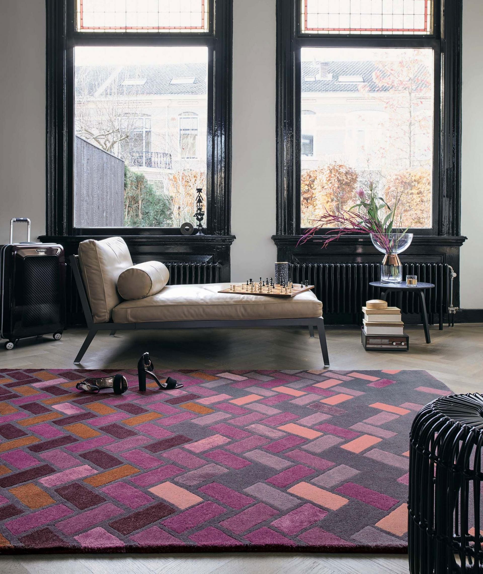
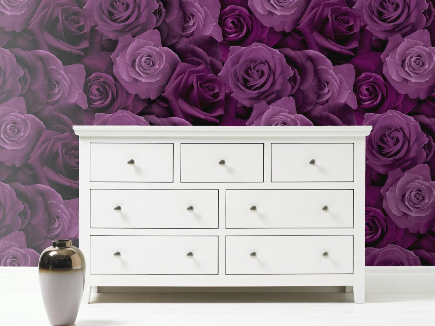
Ultraviolet can transform a room into one of extraordinary self-expression, adding spice and brightness with a tufted couch or accent wall. Conversely, its polish can tone down a room with subdued modern pairings. In large rooms, try dressing a bay window area in a bold wallpaper print, teamed with floor-to-ceiling curtains for maximum impact. For any successful scheme, however, it’s important to use plenty of different tones, from dark to light to give interest and depth, and so as not to overdo the strong accent colour. Don’t be afraid to indulge in every shade from the palest lilac with cushions and armchairs, all the way through to the deepest plum with lamps, accessories and artwork.
When it comes to pairing other colours with ultraviolet, the design consensus is to look to nature for inspiration. Green is a popular choice, but so too are shades of peach, copper and orange. “This exciting choice for Colour of the Year works brilliantly in many different ways, for all different interior schemes,” says Brian Woulfe, founder and managing director of Designed by Woulfe. “For the brave, go hard on block colours and mix this vibrant hue with other visceral and stimulating colours in your home, in a Mondrian style. This will give your space a stylish edge – a heady cocktail of punkish rebellion and regal opulence.”
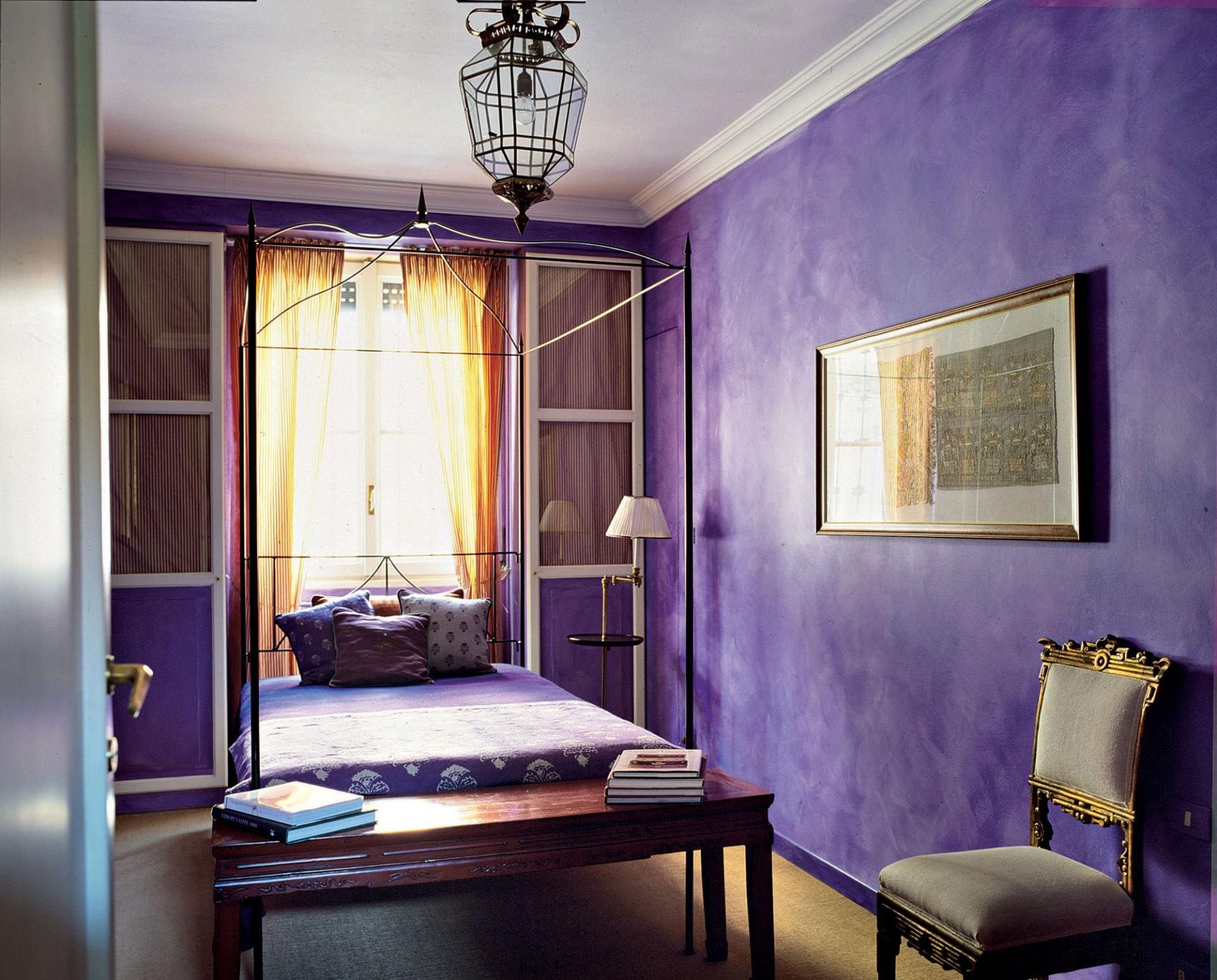
“Alternatively, the intoxicating purple sits wonderfully with the popular grey, earthy tones of last year’s interior trends. Alongside these greys and ochres, the tones are softened and much more seamlessly introduced to pre-existing interiors. “Another great way to introduce a softer version of ultraviolet is to opt for cashmere or soft wool furnishings. For splashes of ultraviolet, add a silk or satin piping to cushions, curtains or armchairs.”
Communicating originality, ingenuity and visionary thinking, ultraviolet is the most complex of all colours, because it takes two shades that are seemingly diametrically opposed – blue and red – and brings them together to create something new. The key for getting this trend to feel fresh and modern in your home is to make sure the colour really stands out. Find the most intense hue you can and let it take pride of place.

