How to make your house pop with Pantone’s Classic Blue
Pantone's Colour of the Year may be a controversial choice, but a sea of blue can transform your home – and your mood
Multi-faceted, sensory and dramatic. The Pantone Color Institute’s shade of choice for 2020 – PANTONE 19-4052 Classic Blue – is one of its most impactful to date. At a time when wellness and mindfulness are at the forefront of all that we do, this bold and brilliant hue serves a dual purpose. It’s a nautical-inspired palette anchor that gives us a stable foundation from which to build, or as Leatrice Eiseman, executive director of the Pantone Color Institute, says, “a solid and dependable blue hue we can always rely on”. But equally it suggests a far-reaching horizon – a “boundless blue evocative of the vast and infinite evening sky.”
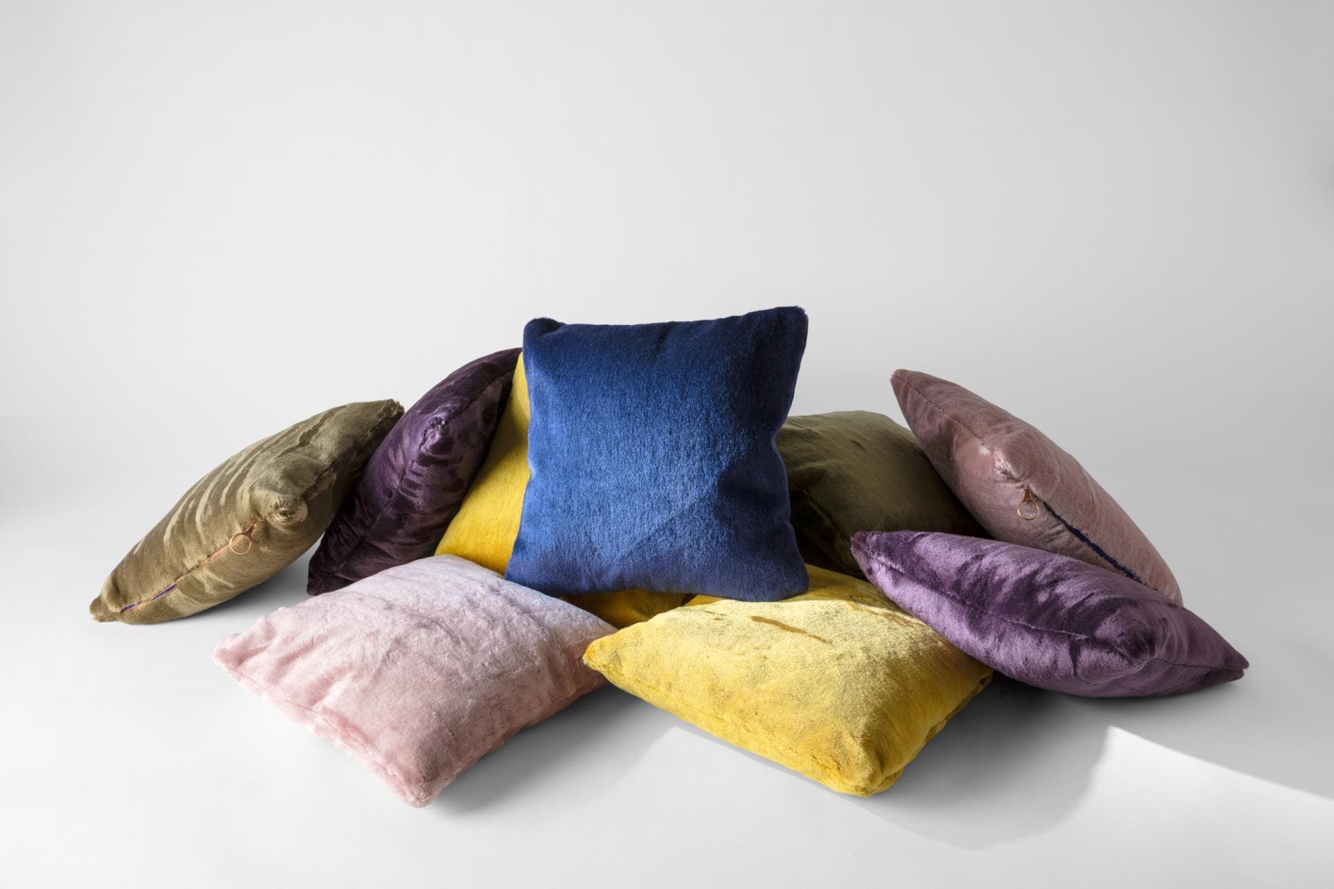
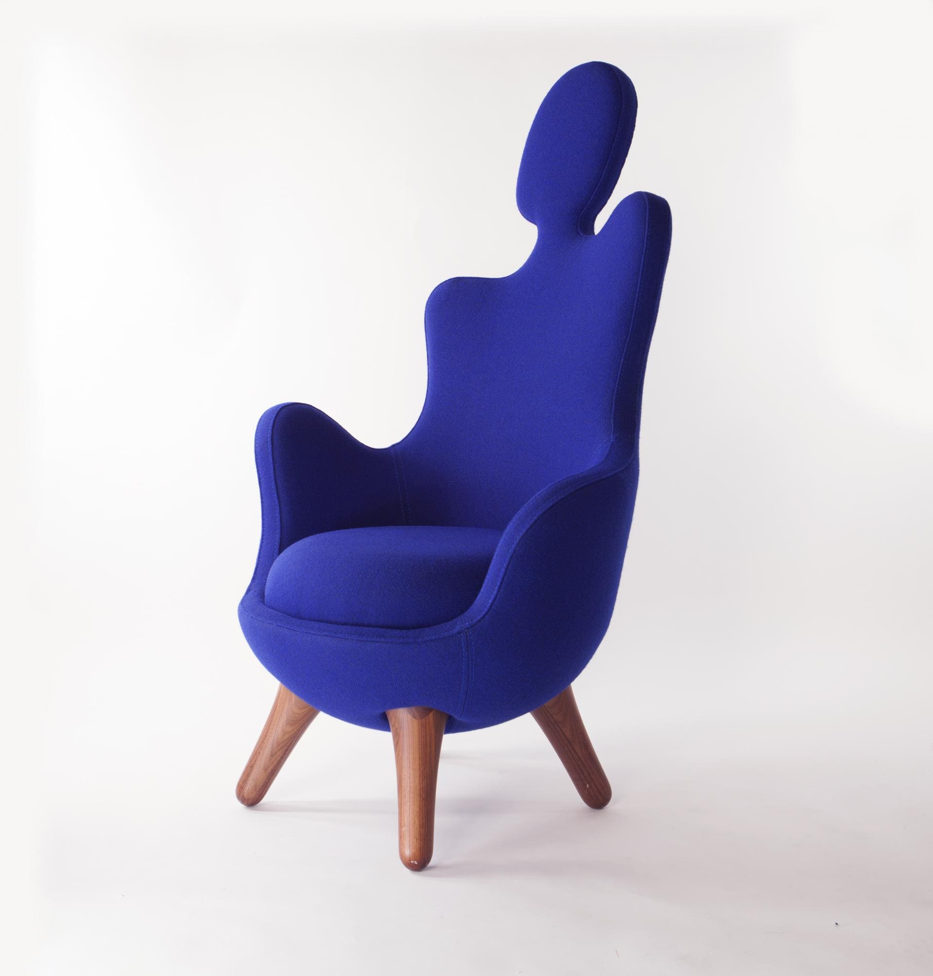
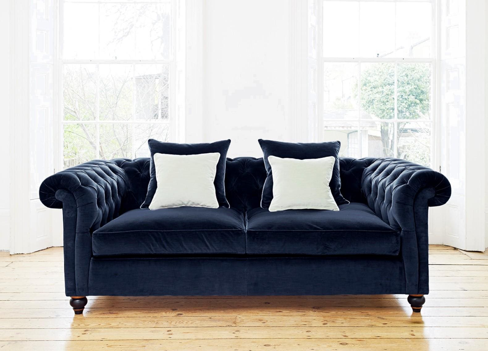
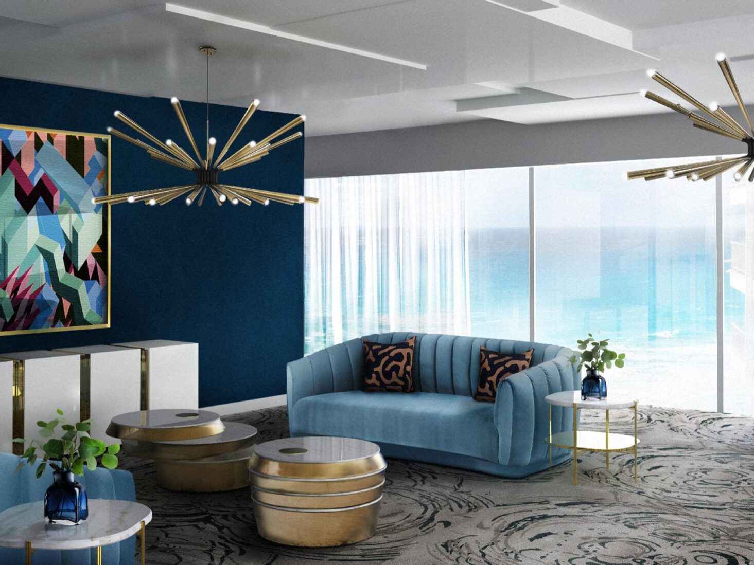
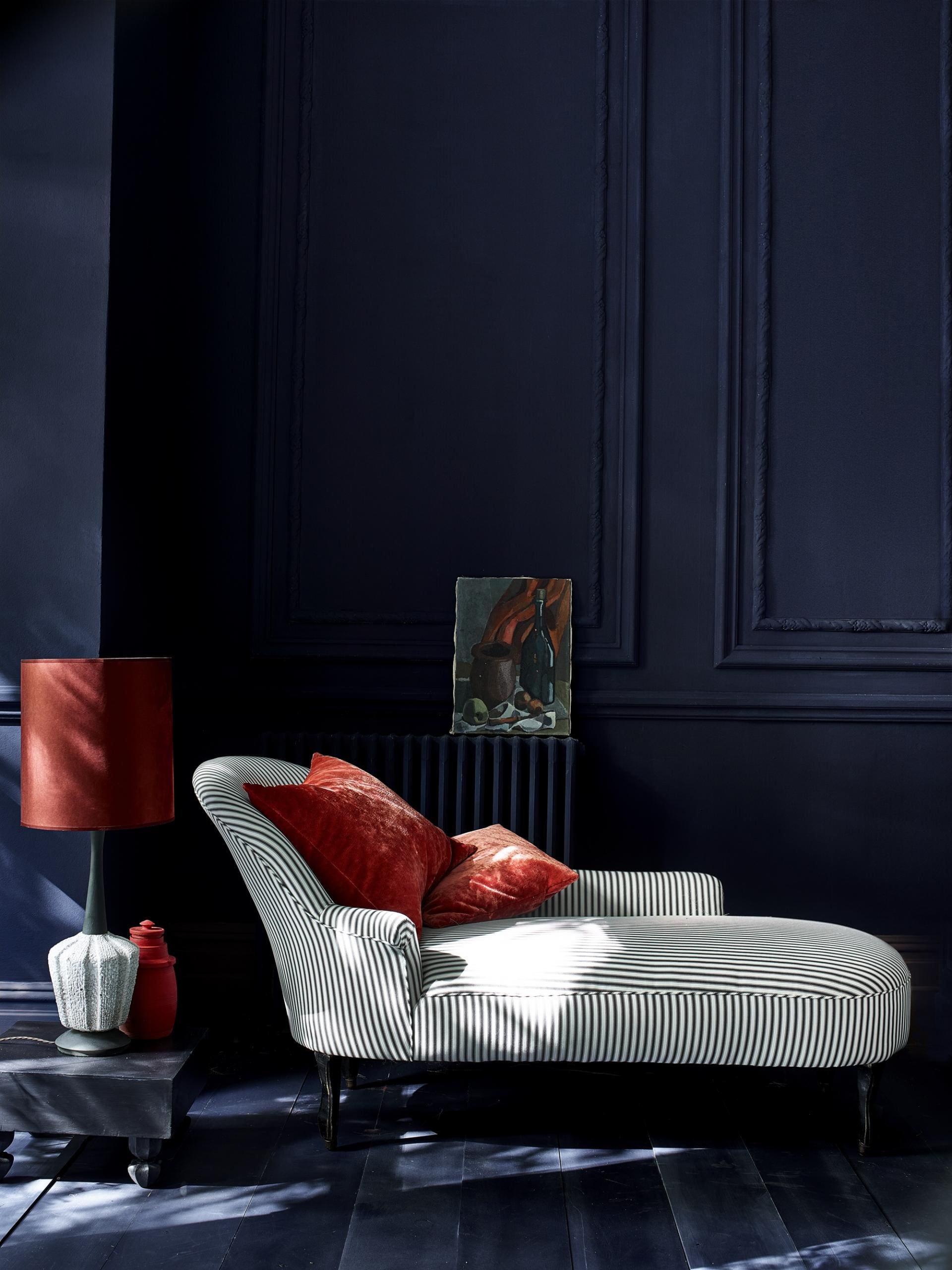
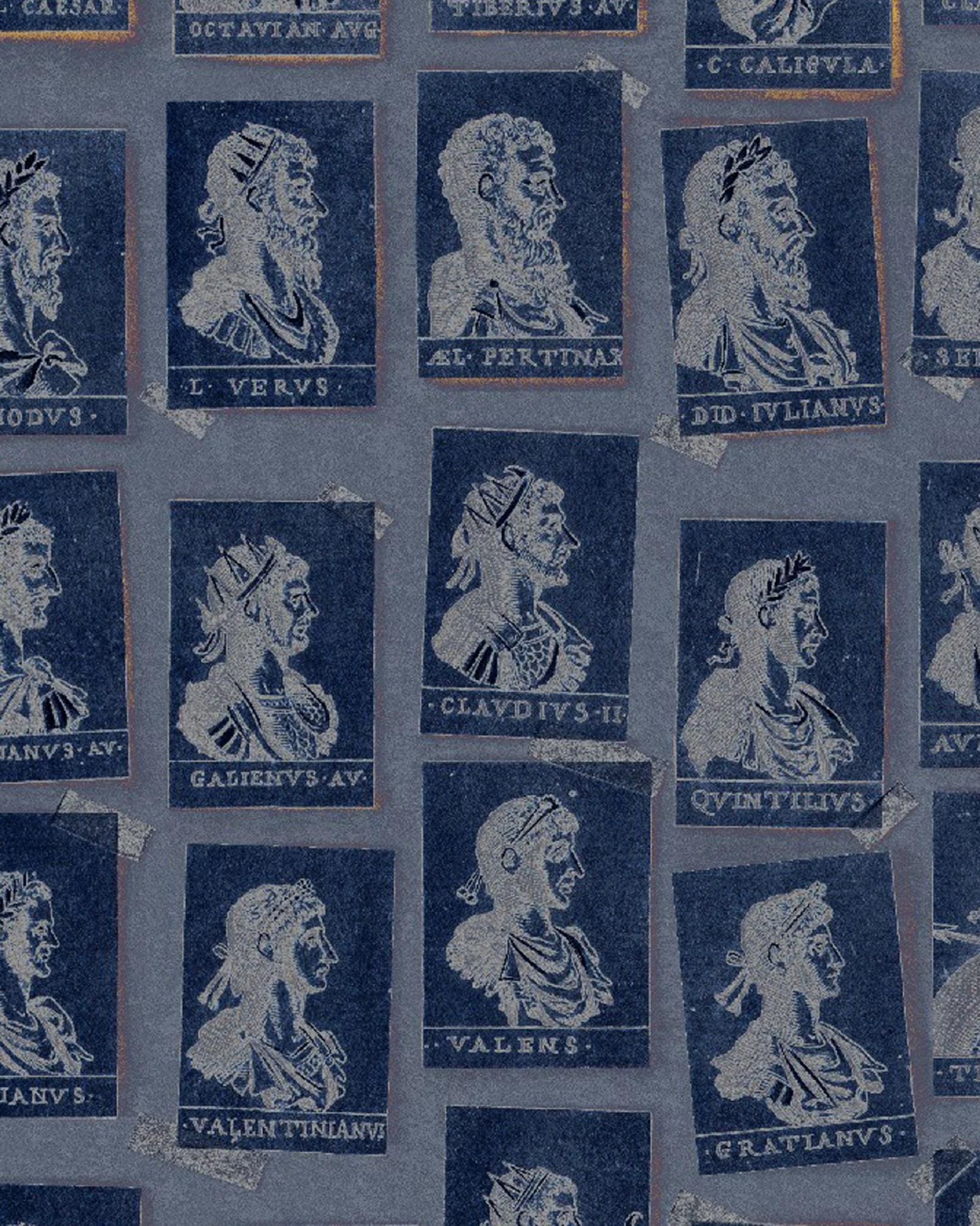
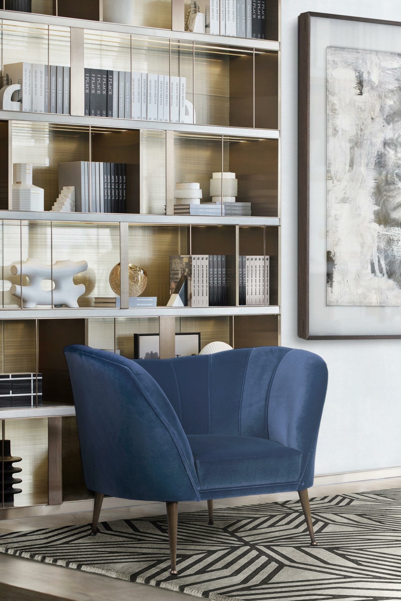
Don’t be scared to be playful with it, too. Mind The Gap’s wallpaper ‘The Home of an Eccentric Man Emperors’ creates an impressive display, while Annie Sloan’s chalk paint can even be applied to floors and ceilings for a truly dramatic effect. Just be careful when dressing up smaller spaces to limit a dark feature wall colour to a maximum of two walls. Pops of vibrant ruby red throw cushions, coral pink rugs and even gold ornamental lighting fixtures truly bring the space to life and draw the eye around the room, as well as provide the perfect finishing flourish.For the more minimalist interior where Nordic chic still reigns, Classic Blue can be even more effective as a central, eye-catching statement piece. The Vincent Darre Chair with its pine legs and jigsaw-like head piece is on trend both in colour and style, while Boca do Lobo’s blue console table is the ultimate head-turning item to dress up an entrance-way or landing. And for the brave, the French Bedroom Co.’s Versailles Sacré Bleu velvet sofa with distressed antique gold gilt finish is the ideal investment piece that will carry you through all seasons. Evoking the sky at dusk in one light to what lies beneath our oceans in another, Classic Blue enables colour mixes throughout the spectrum.
Versatility is at the core of Classic Blue, and that translates to feature walls, accent colours and statement pieces rolled into one. We are well-adjusted by now to the slate greys, midnight blues and emerald greens that have endured in our homes in recent years. And much like the monarch herself, the Victorian-esque colour range has had a far-reaching influence on our homes and interiors and should be celebrated for its longevity. But few colours transcend the old and the new with such dexterity as Classic Blue; just dark enough to enhance our love of gold and copper trim, not to mention make burnt orange accents pop, but equally bright enough to evoke the white-washed walls and turquoise domes of an illuminated, sunny Greek landscape. Winter and summer rolled into one. Dark and light working hand-in-hand. As the Pantone Color Institute says, it’s “genderless in outlook and seasonless in endurance”.
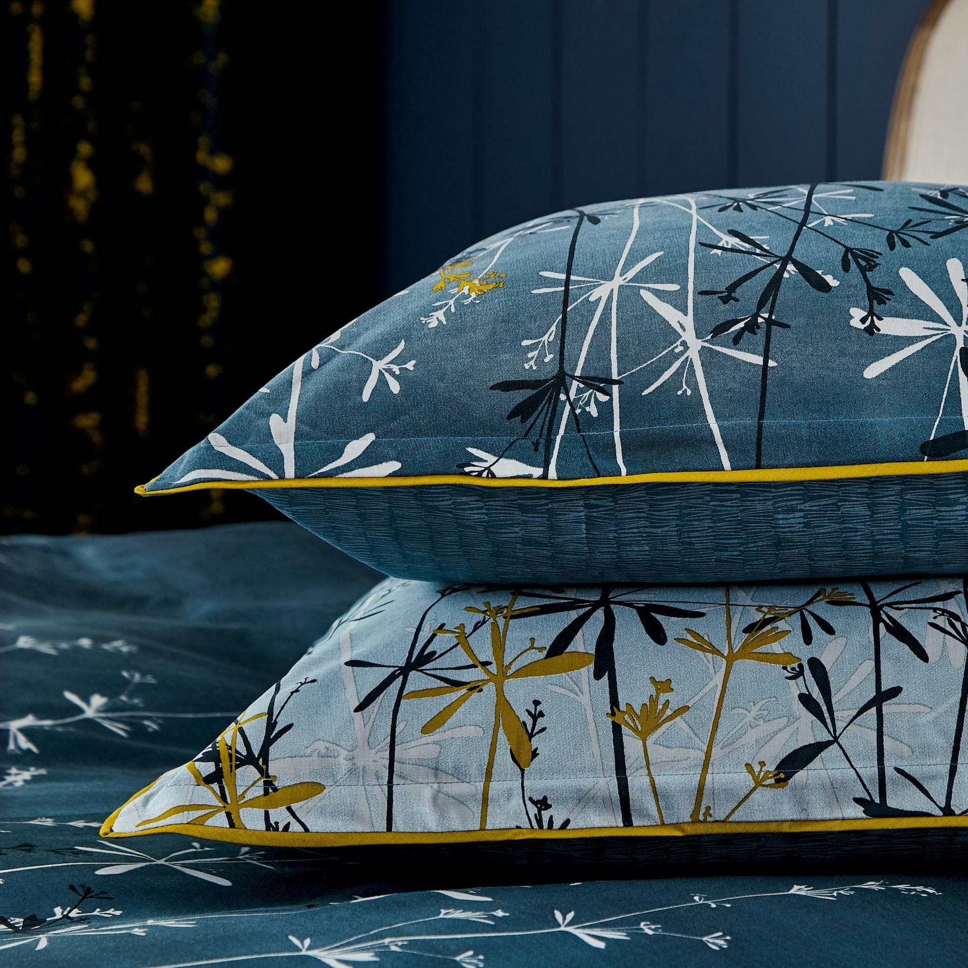
PANTONE 19-4052 is as adaptable as it is elegant. The key when using any colour as rich as this is to layer in shades and texture. Make tonal statements to avoid repetition of the one colour overwhelming your home, and be sure to include lighter turquoise elements and pastel blues to ensure the end result feels warm and welcoming.