Farrow & Ball’s Joa Studholme on the joy of colour
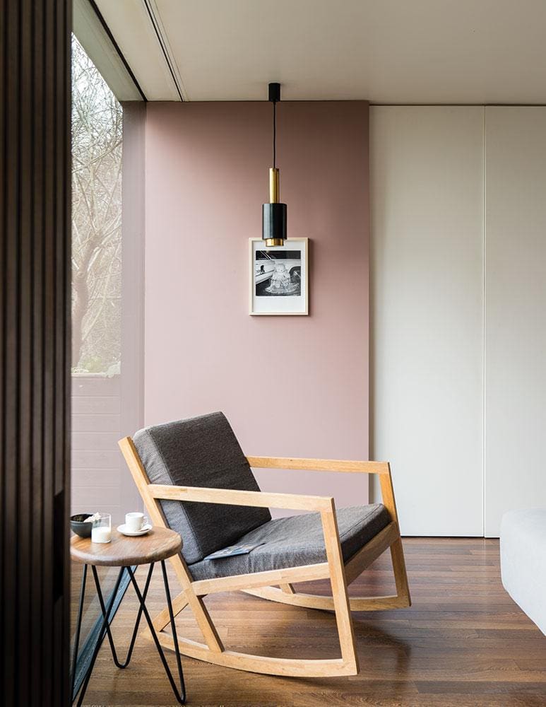
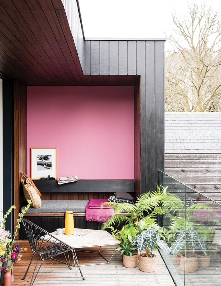
De Nimes Blue is the colour of the season
It takes about five minutes for me to understand why Walpole singled out Joa Studholme as one of the most influential storytellers in British luxury this year. As Farrow & Ball’s colour curator, she’s a visual person through and through, seeing the world as a palette of possibilities and able to explain exactly how a splash of Lake Red, Mizzle or Nancy’s Blushes could enhance my home. She’s also the driving force behind the paints’ names, which have become as much of a talking point as the shades themselves, from Elephant’s Breath to Dead Salmon – the latter a shade which refers “to the flat or ‘dead’ finish of an aged pink painted at Kedleston Hall in 1805”.
The British company has been going strong for more than seven decades, founded by chemist John Farrow and engineer Richard Ball in 1946. They built their first factory in Dorset – where the company is found today – and supplied paint for the Ford Motor Company, Raleigh Bicycles, the Admiralty and the War Office. Notable is Farrow & Ball’s early commitment to going green; nine years ago, its entire range of oil-based paints became eco-friendly, water-based finishes with low VOC (volatile organic compounds). Today’s customers can expect everything from recyclable paint tins to responsibly-sourced wallpapers.
Colour is of course at the heart of Farrow & Ball and Joa Studholme has been in its creative engine room for 23 years. Here she tells us more about her job, her sources of inspiration and how to add colour to your home.
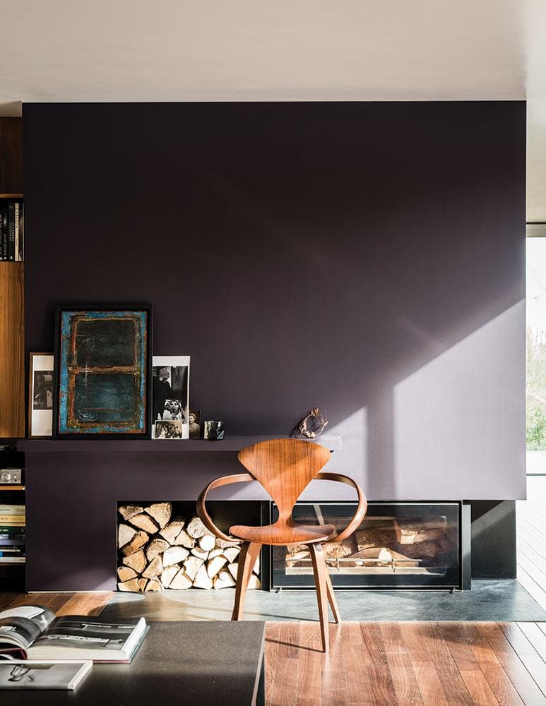
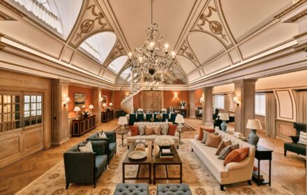
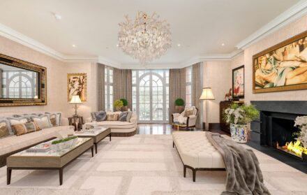
On colour trends: Grey-mania is over, at least in London, but those in the country are still embracing grey, so I try really hard to create alternatives to the likes of charcoal, such as dark green or dark red. Strong colours. People are becoming braver about using colour and that’s down to so many things. Most of it is social media, and Pinterest – users follow people like Kit Kemp who use loads of colour. I do lots of consultancy and the same images always come up. There was a time when all the interiors magazines looked identical and you’d think, ‘I’ve seen this house before’. It could have been in LA or Dalston. The great thing about decorating at the moment is that all the rules have gone out the window.
On the Farrow & Ball colour card: I try to create a palette that is thrilling and intriguing and empowering. The reason I say empowering is that hopefully people look at a colour and think; if Farrow & Ball is offering it, there must be room for it in my home, even if it is in the smallest space.
On her current favourite colour: Right this moment? I’m slightly obsessed with gloss, so Bancha in full gloss. It’s a darker colour, named after Japanese tea leaves, because it gives the feeling of having a cup of tea. I really love it. I have a little house in Somerset and it’s all new colours – I cannot resist changing them all the time!
On the stories behind the paints’ names: To me, these are as important as the colours. Over the years, we’ve talked about them much more because people love them, and are enthused by them. Sometimes the name comes first. We never say ‘let’s just call it that’; they are always really thought through, as we love a tricky word. That’s also intriguing for people, and they’re brilliant selling tools, too.
There are Farrow & Ball fanatics who have named the tables at their wedding after certain colours. They love the associations. Treron is a green version of Pigeon, and a treron is a green pigeon, although it sounds like something out of an LA gang! It’s about getting people to think. It could be a silly or old story – the pigment for India Yellow was originally found in the urine of cows. Inchyra Blue, a bespoke colour I made for Lord and Lady Inchyra, is a very uncertain colour. Is it blue? Is it green? Is it grey? You can’t quite tell. It was really popular, and there was a lot of intrigue about how to say it.
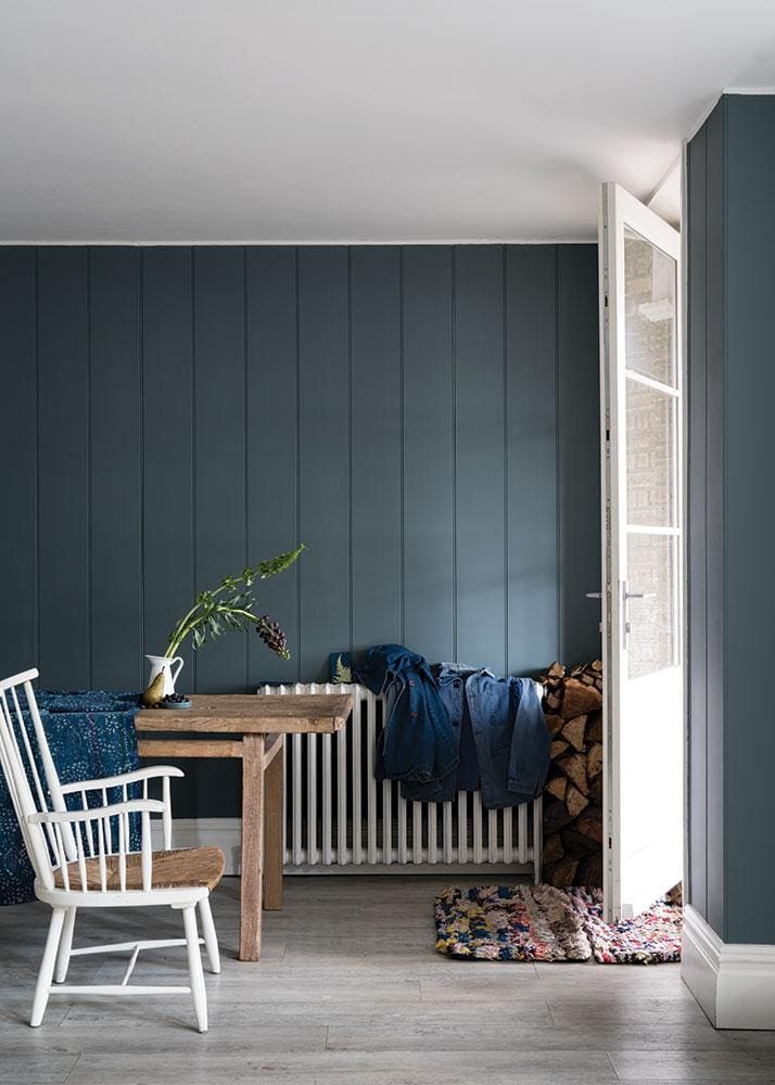
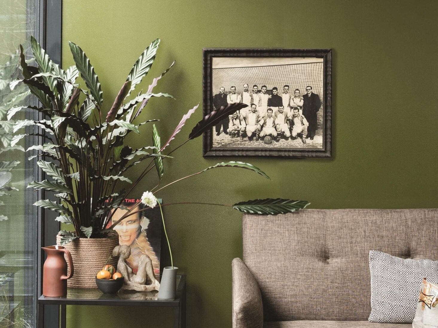
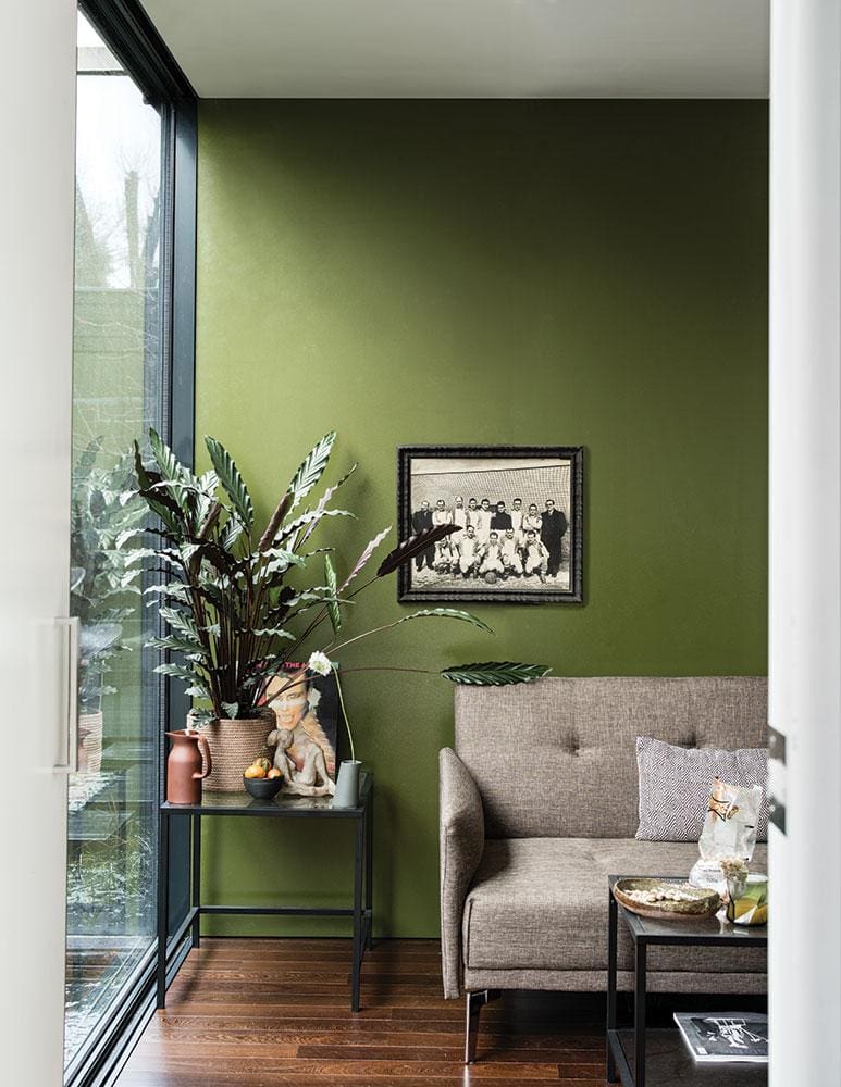
On new colour De Nimes: This has been very popular and was totally inspired by workwear. A lot of people, when I first presented it, just thought it was me being pretentious! It’s fashionable but very down-to-earth, exactly like denim. Denim never goes out of fashion. The name really suits the colour. It’s all a bit subliminal.
On the creative process: It’s so radically low tech, what I do. It’s bonkers! People imagine this great big laboratory and it’s just me at my table with ramekins and spoons. One knows the colours that one might want to put forward; I know because I’m out on the road all the time in people’s houses so [I can spot], dare I say it, ‘gaps’ in the Farrow & Ball palette.
On the book Recipes for Decorating: Difficult second book – difficult second album! Hadn’t I said it all in the first book? We decided it would be interesting for people to see all my advice in action. It took a little time because we had to find 13 houses around the world and [owners who were] willing to have them photographed. I was thinking that all the elements of a room are like the ingredients of a recipe; you have to balance them correctly to get them right. So we’ve done a case study of each house and given literally every single ingredient that went into it, including light, how colours combine etcetera.
Farrow & Ball: Recipes for Decorating by Joa Studholme, photography by James Merrell, £30, www.octopusbooks.co.uk